
ABSTRACT COMPOSITIONS
Each of the following compositions were created with the most basic principles of design in mind: weight, scale, texture, direction, form, space, and color. The first two were created traditionally; the remaining six were created using Adobe Illustrator and scans of hand-drawn elements. Click on any image to enlarge.


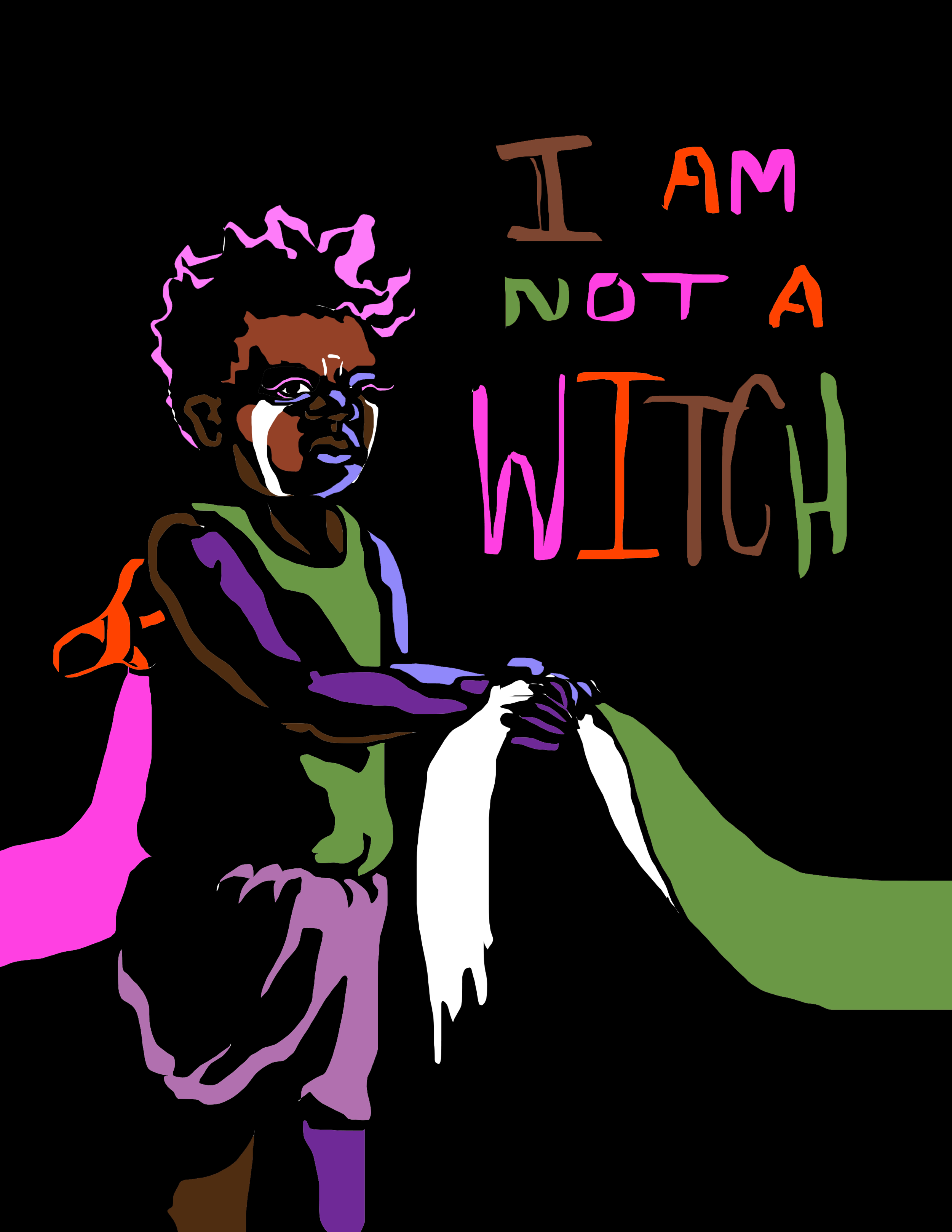
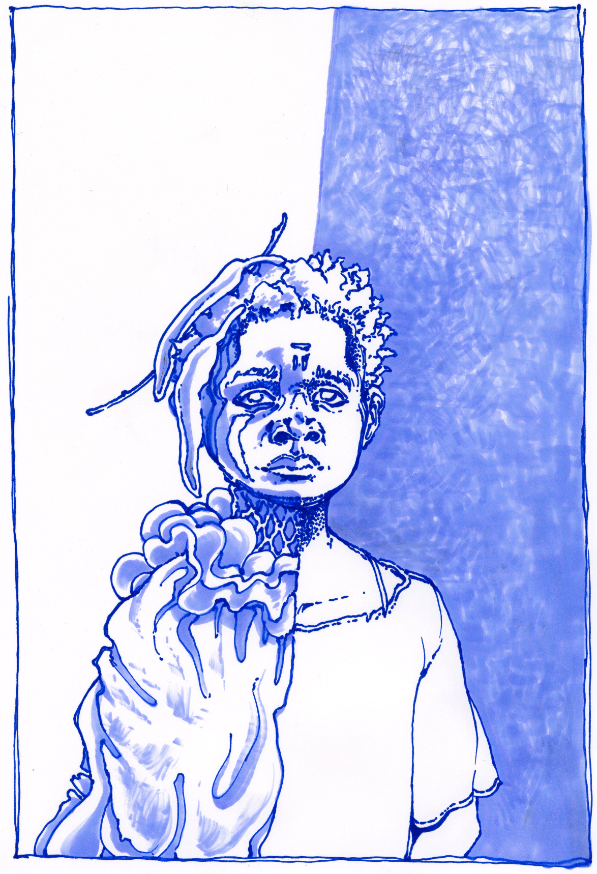
Based off Rungano Nyoni’s film I Am Not a Witch, these two covers were designed for a hypothetical book adaptation of the screenplay.
I AM NOT A WITCH: BOOK COVER CONCEPT


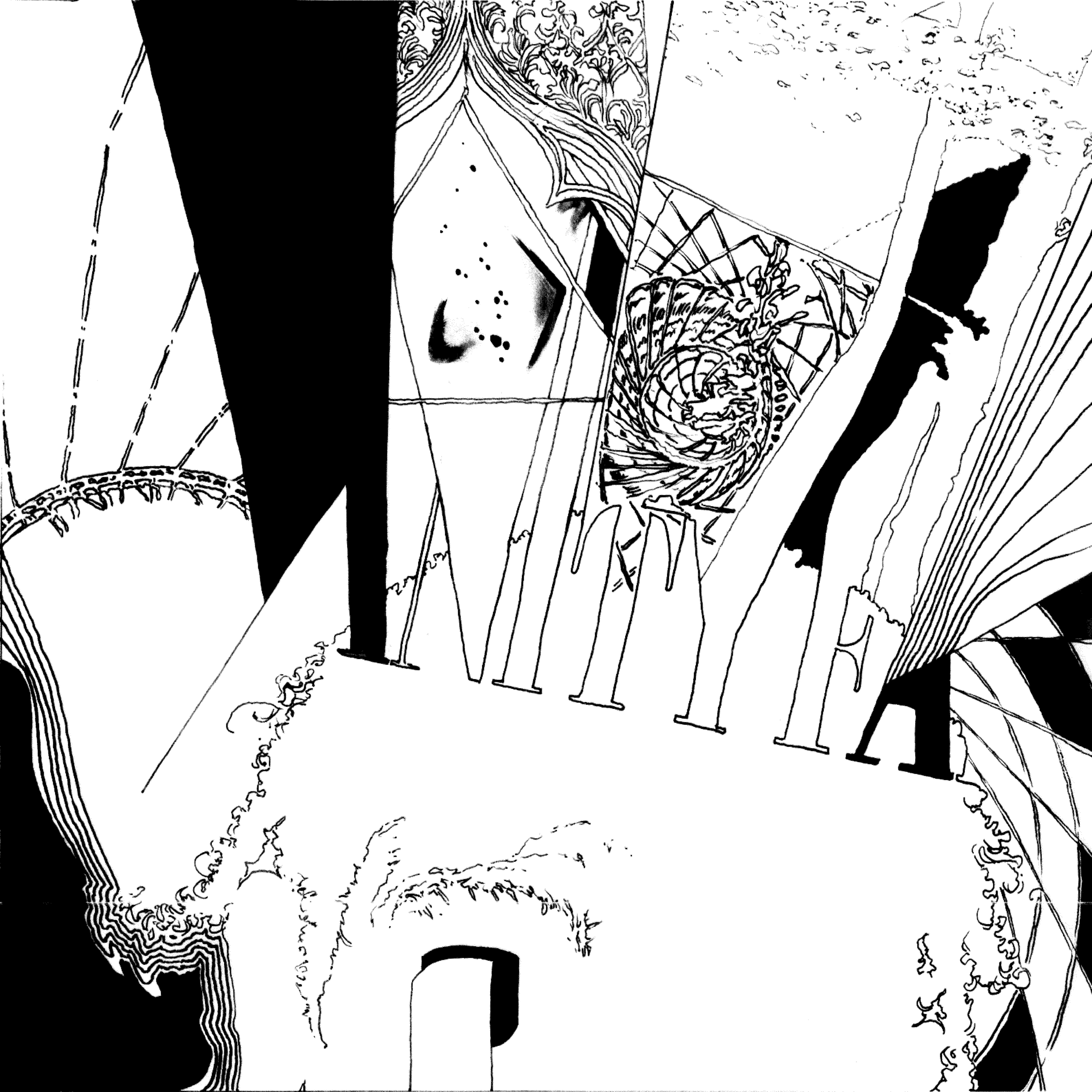
Below are some of the directions explored in concept and medium before developing the most successful into the two final covers.


“Where are We Now?” is a poster researched and designed over a period of two months at the start of 2020 as part of a self-driven project to create material that brings the litany of statistics proving the existence of systemic racism in America together in a visually-compelling format. It is double-sided, with the front converting the project’s title into a giant timeline leading from the arrival of the first slave ship in Virginia to the present day.
1619 - 2020: WHERE ARE WE NOW?

Use arrows at both sides to navigate.


A few sample typefaces developed in a range of styles.
TYPOGRAPHY


ELEVADO


An outdoor restaurant seating area located in an alley of a chic neighborhood in Los Angeles. This project began with location research, informing initial sketches and further development in Rhino with inventive ways of using the space before settling on the final concept (below). The stylized, removable tower of taco plates (above) reflect the restaurant’s effort to elevate the area’s tradition of quality Mexican street food in a fun, maximalist-modern setting.


TUI JOLI - PANDEMIC-READY VALET
This project’s aim was to use extensive targeted consumer research and real-life data collection to develop a valet (household organizer) adapted for use in a pandemic-altered modern world. Data collected from an informal focus group was used to shape the design process, resulting in a highly portable valet tailored to meet the needs of a working, driving, dog-walking, outdoor-exercising quarantined public.


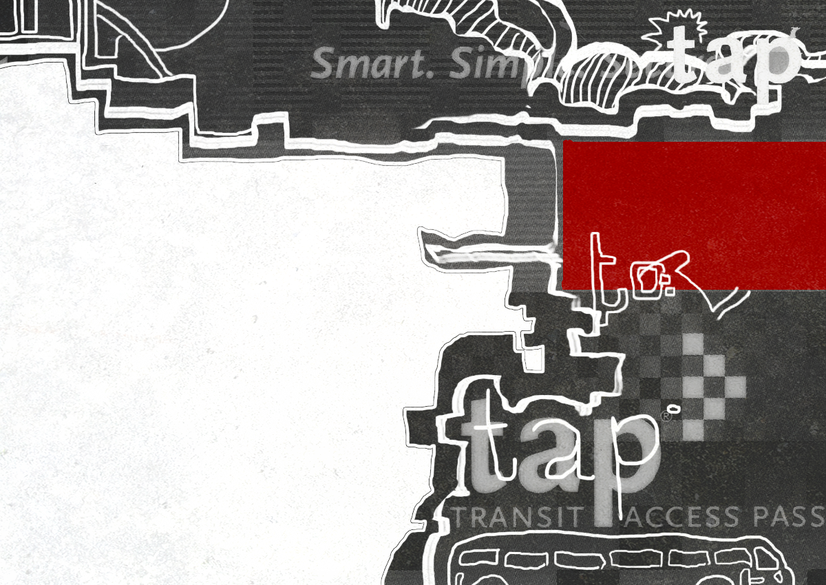
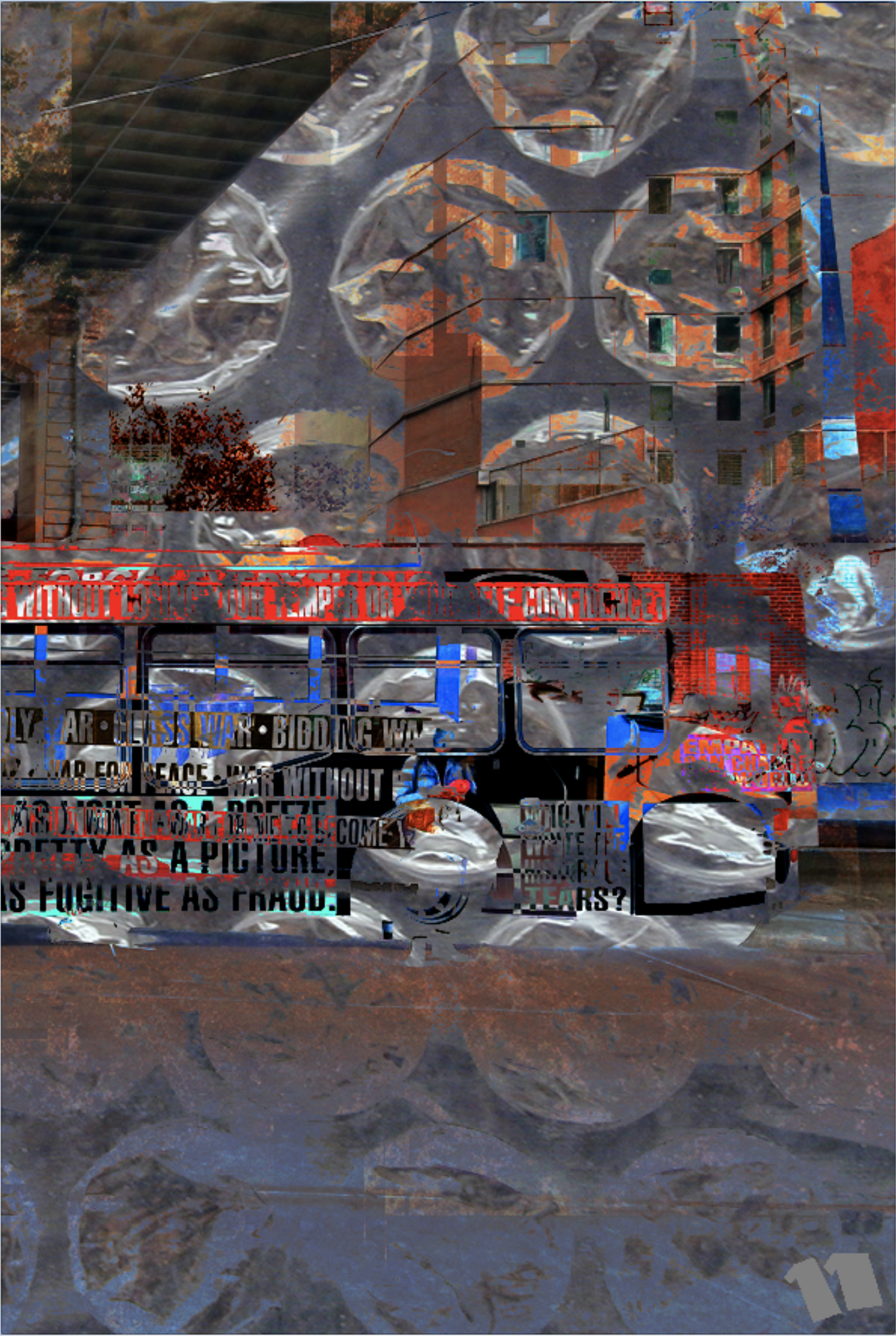
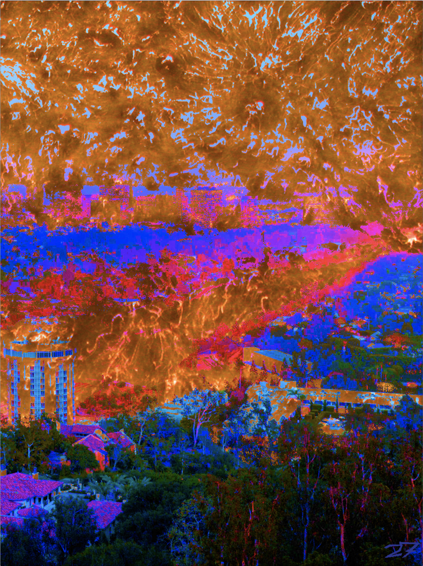
LOS ANGELES: CITY ON WHEELS
Los Angeles: City on Wheels is a project in two parts. The first, shown below, is a series of postcards—each one representing a different method of transportation essential to the city’s residents. These postcards were ultimately printed and came with their own specially made packaging, designed to evoke the urban, industrial feel of the city’s transportation systems. Click on any image to enlarge.


The second part of Los Angeles: City on Wheels is a hand-bound, French-folded book, a visual exploration of the LA resident’s morning commute, transforming the experience of sitting in traffic into a journey through the heart and spirit of Los Angeles. Use side arrows to navigate.


TEXT AND IMAGE
The work below is a collection of commissions and collaborations from the last few years, including three covers of Marin County satire magazine The Leek and the cover and a four-page excerpt from upcoming graphic novel (written by Asher Sinaiko) The Right Hand of Darkness: A Tale of Bloody Revenge. Click any image to enlarge.


